Figure 1 below shows farm size values in descending order by bars, and the cumulative total is represented by the line.
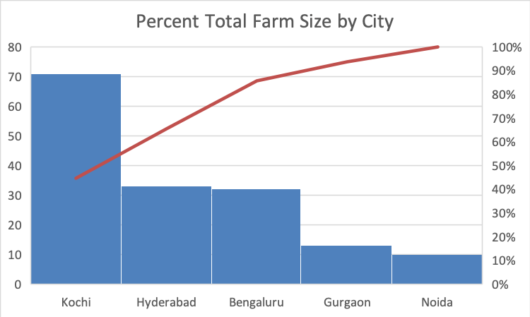
Figure 1. Conduent-accessible farm size pareto chart.
The above pareto chart shows the distribution of farm size in the regions to which Conduent has access. It makes the most sense to pilot a program in the city of Kochi. Since this is the largest percentage of total farms in Conduent-accessible areas, this region would provide the most potential for return on investment. Still, if Conduent is in any insecure about how best to proceed or set up processes to help farmers, the company could choose to pilot a program in the smallest area (Noida) to work out the kinks of the program, develop a system with little risk and less investment, and then roll out a more robust solution to areas like Kochi when the proper infrastructure is in place.
Post #6 in this series explores a target area analysis.
